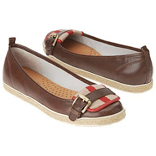
just got back from southern alabama where b & i attended and celebrated the gorgeous wedding of one of my closest college friends (which will explain my lack of posting towards the end of last week. sorry, we left thursday afternoon. a solid seven+ hours in the car means there was no time to spare for blog posting) anyway, i'm thinking of her (with a little bit of envy) today as she is getting ready to go on her honeymoon to paris/europe with her sweetheart for three whole weeks. picturing my newly-wedded friend skipping through flower markets in these little flats.
{live vicariously through mgm's parisian holiday :: michael by michael kors east sider slip-ons on sale for $87 at shoes.com}
31 August 2009
26 August 2009
{cozy canteen}
have i told you about the little bar nook that we want to make under the stairs in the bungalow?? ok check this out.
here's our space. (straight ahead will be the den & around the wall on the left is the front door)
and voila! here is the after photo. only, no. this is thom filicia's genius wet bar. but throw up some wood planks/beadboard and a few open shelves (oh and i'll have to show you a photo of the bar table/console on wheels that we have later (my first major purchase on ebay, i'm so proud), which will solve the dilemma of accessibility to the little door (see above) that will contain the water heater). and there it is again, right on thom's stairs: saturated inky-black paint. aside from providing some glamour, don't you think it makes the space seem much more grown-up? dark colors are not for babies, you know.
{above image :: thom filicia's kitchen photographed for domino.}
p.s. closing is delayed. harumph. but probably for the best, as the appraisal has been held up. nothing major or evoking any heartbreak, supposedly all is still just fine, but it is delayed, which is frustrating as it seems there is always something... so we have rescheduled to monday. keep your fingers crossed that this is the final hoop we are jumping through. i feel like when all is said and done b & i will be worthy of a standing ovation. ta da! of course i will make a big announcement here, and hopefully that'll be monday.
25 August 2009
{belated monday shoes}
i know, i know...monday has come and gone. in my defense, i was a little sick yesterday. was thinking it was strep throat, but no, my feared deathy illness has just settled into a really annoying summer cold (why is it that summer colds are so much worse than winter colds?). i think going out of town (and having too much fun) for multiple weekends in a row has really started to wear on my immune system. (but not to worry, friends in alabama, just a little dayquil and i have everything under control and promise to be in tip top shape by this weekend.)
so in my usual fashion, i figured i had to give you some ruffles to make it up to you. b is not going to be pleased by this post as he dislikes any shoe that fits into the "bootie" category, but how cute and feminine will these ruffle booties look with tights and a fall skirt??
{make it ruffle :: dollhouse kim $70 at piperlime (brown or black), madden girl raleigh platform ruffle bootie (though these come in other colors, i'm telling you, you're going to want some purple for fall) $49 at dsw, js by jessica truffle peep toe ruffle bootie $69 at dsw}
Labels:
fashion,
monday shoes,
ruffles,
shoes
21 August 2009
{making a kitchen}
i have a new favorite movie. julie & julia. yesterday evening, kl and i shared chocolate malt balls while salivating over julia child's french food masterpieces. aside from making your mouth water, this is a feelgood, laughoutloud, charactersareyourbestfriends kind of movie (albeit several horror film previews pre movie, not sure what that was about..). anyway, all the thoughts of cooking have really got me thinking about the bungalow kitchen. and i think i may have found our perfect cabinet color, courtesy of windsor smith's beautiful l.a. home. drink in the sultry hue of benjamin moore's polo blue (hmm, just found the paint swatch online and it looks
::n o t h i n g:: like this inky midnight blue we have in the photos below. does it look like an ugly brown on your screen, too? whyyyy? ...in any case, the color i'm hoping for is that in the photos below).
now picture the bungalow kitchen cabinets drenched in polo blue (or a variation, if polo blue does in fact = baby poop brown) with satin nickel cup pulls (at least the drawers), coupled with my farmhouse sink (<3), gleaming white deck floors, and we'll need a pop of color somewhere...i'm thinking maybe we'll paint the back door turquoise (not unlike one of my all time favorite domino magazine kitchens, see last photo below).
see the amazingness of a pop of color in a dark space. i'm also still having a romance with that chandelier. so yes, add that onto the bungalow kitchen list above.
{images via :: house beautiful & domino (last one only)}
p.s. happy weekend! this weekend b & i are heading north for a richmond wedding and are looking forward to making all kinds of bungalow related lists during the 7 hour car ride.p.p.s. can i trade jobs, please?
::n o t h i n g:: like this inky midnight blue we have in the photos below. does it look like an ugly brown on your screen, too? whyyyy? ...in any case, the color i'm hoping for is that in the photos below).
now picture the bungalow kitchen cabinets drenched in polo blue (or a variation, if polo blue does in fact = baby poop brown) with satin nickel cup pulls (at least the drawers), coupled with my farmhouse sink (<3), gleaming white deck floors, and we'll need a pop of color somewhere...i'm thinking maybe we'll paint the back door turquoise (not unlike one of my all time favorite domino magazine kitchens, see last photo below).
would love to have enough space for a big ol table in the kitchen, but just around the corner will work just fine, too. i suppose you've gotta take the space as it's given to you (or at least as your money will allow). but i can't help daydreaming about windsor's centuries old french wooden table cozied up to her gleaming stainless steel range.
wishing carrera marble was in our budget... though while admiring it i just noticed smart skinny shelves above/around the sink
see the amazingness of a pop of color in a dark space. i'm also still having a romance with that chandelier. so yes, add that onto the bungalow kitchen list above.
{images via :: house beautiful & domino (last one only)}
p.s. happy weekend! this weekend b & i are heading north for a richmond wedding and are looking forward to making all kinds of bungalow related lists during the 7 hour car ride.
Labels:
cabinets,
chandelier,
kitchen
20 August 2009
{window shopping}
sadly the windows of the bungalow are going the way of the wind once the keys have been turned over to b & yours truly. aside from the fact that the windows are old, drafty, and have single panes, apparently many of them are rotting (if even existant) and are not in good shape. ...so, we decided that before we move in, our windows are going to get a complete makeover. lately i've been trying to track down the perfect window style that will still have the 1940s charm to stay true to the look of the house. and really we can't complain about the savings we'll see in our utility bills.
so first up, are the paned windows. panes (in my mind anyway) tend to look better when they are thinner (elegant lines + less blockage of marsh views = win-win). also, i'm not completely committed to the idea of painting some of them a color (e.g. serene robin's egg blue window below) but i think i'd definitely like the option (i.e. interior panes must be of a material that can be painted. ... if budget allows.)
ok, yes, we do not have any windows that could begin to look like this, but just humour me for a moment while i pretend.
more panes that aren't white but are instead have more of a natural rustic finish to them. don't think i'd want all the windows to look like this, but i do like the idea.
budget constraints means our windows are more than likely going to look a lot like the below windows. and really, i like the double hung paned windows. of course the subway tile to go along with them is nice too.
hmmm, what about black trim?? considering we plan to paint the floors white, painting interior window panes black could provide some needed weight to the rooms. also, notice the small hand grip hardware on these windows. details like that could help tie the windows back into the 1940s style of the house.
more dark panes. really looks elegant in this light colored room. love the style of these windows too, but i'm wondering if they open. let's hope so.
i think our windows do need a pane here and there. these, while lovely, are probably too modern for our bungalow. that window seat looks comfy though, doesn't it?
while our bungalow doesn't have a real sun room, these windows --which according to google, i think you would call them french casement windows-- could work in so many places. and i am a little bit over the moon for them ..
yes, i think these windows would fit in quite beautifully with our house. but not holding my breath while i track down pricing.
still loving this. and how perfect would these windows be in our bay window?
ohhh and french casement windows with panes.
mhmm, i'll take these, please.
what do you think?
{images via :: living etc, azulskies, country living, this old house, mary mcdonald via shelter, ny times, johner bildbyra, domino, delikatissen, black white yellow, interior devine ... sorry, no time to track down the links, just google :) }
Labels:
window seat,
windows
19 August 2009
{bungalow garden}
i'm sorry things have been a little bit slow around here...my attentions have been pulled elsewhere as we are closing on our marsh bungalow next thursday (hip hip hooray!). just trying to dot all the i's (and there are quite a few to dot, sheesh). but i have lately been daydreaming about the secret garden. won't you join me for breakfast on the terrace? (just through these sleek ebony french doors)
17 August 2009
monday {ballet} shoes
update your tired ballet flats with a leather woven pair to pirouette gracefully from summer to fall.
{make them yours :: bcbgirls gentle on sale at piperlime for $49-59, ciao bella fantasia on sale at piperlime for $59}
Labels:
fashion,
monday shoes,
shoes
14 August 2009
{summertide}
daydreaming of a hazy summer holiday. heading to the south carolina shore for the weekend.
{my summer daydreams were found via audrey hepburn complex, a new favorite for pretty things.}
.
and oh, this is brilliant. wish this was mine. and this is so very flattering.
{my summer daydreams were found via audrey hepburn complex, a new favorite for pretty things.}
13 August 2009
{sew space}
so big things have been happening since i took the sewing class at fabrika. After a month or so researching and visiting local sewing shops, i finally purchased my very own sewing machine. (if you're thinking about getting one too, one of the most useful resources i found was this string of comments over at apartment therapy) i will also say that i splurged a little more than i'd intially planned to and made the decision to buy a higher end sewing machine with the promise that it will last me a lifetime and also comes with a 25 year warranty (and free classes to boot!). since the big purchase, i've been thinking of all the ways to make over our future studio/sewing/office space (don't you just love that fake wood paneling...haa). anyway, i seem to have picked up a small collection of workspace images...
wish list :: vintage dress form. bolts of sunbleached florals.
{images via :: desire to inspire, house beautiful, we heart it, southern living, what anna loves, delikatissen}
12 August 2009
{an island of your own}
consider your kitchen lucky if it has enough space for an island. if ours did, i am certain i would choose one of these beautiful farmhouse style work tables to take center stage.
this light weathered-wood is a nice contrast to glossy grey cabinets (still loving dove grey in the kitchen + white dishes)
pair with industrial inspired stools & a kitchen can never have too many cooks. and i'll take my kitchen with a fireplace, please.
or take a french bistro style with a gleaming marble table top. pull up black bentwood cane chairs & sip cozy afternoon cafe au lait.
{images via :: desire to inspire, home sweet home, desire to inspire, southern accents}
Labels:
kitchen
11 August 2009
{home office makeover}
found these before & after photos on country living yesterday and what a difference these improvements made! lots of good ideas and design inspiration. even the ceiling was warmed up with a coat of paint.
here's the before photo. bland white walls do nothing for the room.
the old bulletin board gets some gilded glamour. find instructions to make your own at country living
this is an idea i think i'm going to steal :: filling an armoire with amenities for guests. find towels, sheets for the air mattress (which is tucked away in a trunk in the room), blankets, and extra toiletries. makes the transformation from office to guest suite quick and easy.
another clever idea :: adding more storage above the door frames is both useful and gives the room a lived-in library feel, plus a perch for display pieces. loving the rustic twig shelf against the romantic floral wallpaper.
even the closet interior was madeover. painting the shelves an actual color, rather than leaving them stark white, gives this closet a much more finished look. and sticking the printer in the closet is such a smart way to keep it hidden. look closely and you'll see pretty ribbon adorning the edges of each shelf. i don't think any inch of space went unnoticed in this project. can't wait to take on our sunporch/studio/office/guest space in what will soon be our very own bungalow
Subscribe to:
Posts (Atom)